OK, gang. I need your honest opinions. This time, it's only 2 questions with 2 options each. This should go a lot smoother than the mascot post, because there are only 4 choices, as opposed to the 15 mascots I paraded about.
Vistaprint.com, where I make my business cards, is having a big sale and I figured I should purchase a lot of cards while the gettin' is good. It's an easy way to promote this site to people I know, and there's something about designing a business card that has always appealed to me, even when I was a kid. My friends and I would go to the mall and hit up this little printing machine to make fake business cards. Most of them had shitty names and titles like "Pedro Rooster: Cock Man" or "Judge Penis: I Call The Shots". You know, 6th grade humor (like anything has changed).
Businessmen are lame (and rich), so by infiltrating and subverting their business card monopoly, we disrupt society and cause financial institutions to collapse. Rice and popcorn futures plummet. Steakhouses go under. Burger Kings around the country experience flesh mobs and mayonnaise shortages.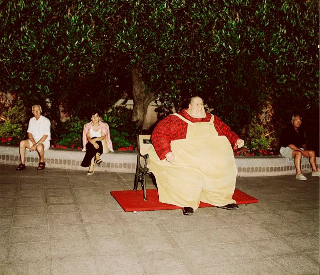
I've made two designs for the front, and two designs for the back. Just let me know what you like or dislike about them shits today, like NOW, because I'm ordering them tonight. Here goes it...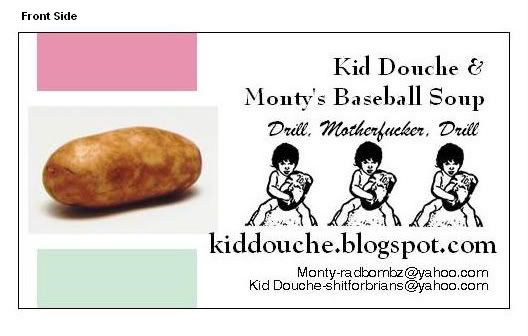
OR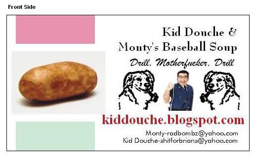
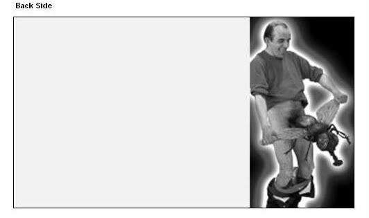
OR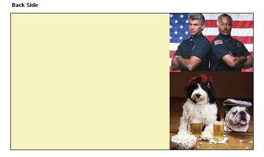
Thanks in advance, Internet comrades.
Saturday, September 13, 2008
Help Us Choose a New Business Card
Labels:
burger king,
business card,
mayonnaise,
poll,
vistaprint
Subscribe to:
Post Comments (Atom)


2 comments:
2 of A, for please. btw, the email lines are kind of confusing... put some spaces in that shit.
What about the font? Red website vs. black website.
And no, I don't run a black website. Although...
Post a Comment